So below i've added some photos that i think are examples of ingenious advertising. All in the area of typography. All of them speak for themselves as to why they are included. Hope you enjoy them as much as i did!!
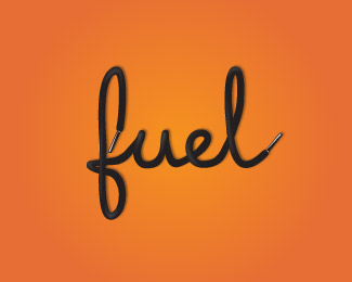
This is for a fitness company called fuel fitness. Now you see why it's so clever.
It wasn't until recently that i noticed the little white arrow point right between the E and the x
This is a tabaco advert in Russian.
So that's it to begin with, there are obviously so many more and i'll definitely be posting more in the near future, but these are just some of my favourites. I would love to hear your opinions and if you have any links to other good sites with interesting typography they would be well received :)
Thanks,
Ryan


No comments:
Post a Comment